A UXer’s Guide to Characterizing Tasks
As UX designers, we are fundamentally engaged in helping users perform tasks. As such, we spent much time designing from the task perspective — understanding how tasks are currently performed and crafting ways tasks can be performed more easily and enjoyably in the future. In this article, I look at artifacts and methods used to work from the task perspective throughout the lifecycle of a design effort.
Keep in mind, however, that the task perspective is one perspective — designing necessarily means also working from the structural perspective. Object models, site maps, system vocabularies, design systems — these are all structural-perspective artifacts.
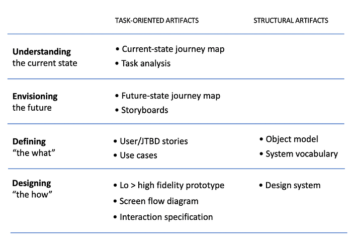
The table below lists common task-oriented and structural artifacts, bucketed into an idealized product definition flow.

The discussion that follows is intended to be an overview of the most common task-oriented design artifacts. It is not intended to represent the entire range of design practice, and the idealized product definition flow is just that — idealized. Processes may differ and artifacts may be created at various stages in the process. For example, very low fidelity prototyping might be done as an envisioning exercise to explore the future direction for a product.
Understanding the Current State
At the start, it’s essential to understand how users currently perform tasks (the current state), an understanding typically gained through observational research. This is true whether you’re creating a brand-new system or looking to improve an existing one. People might accomplish tasks using a variety of tools: an existing system designed for the purpose, spreadsheets, whiteboards, paper-based checklist. Some tasks might flow smoothly; others not so much.
Two main artifacts that communicate current task flows are:
- The current-state journey map
- Task analysis (diagram and narrative)
The Current-State Journey Map
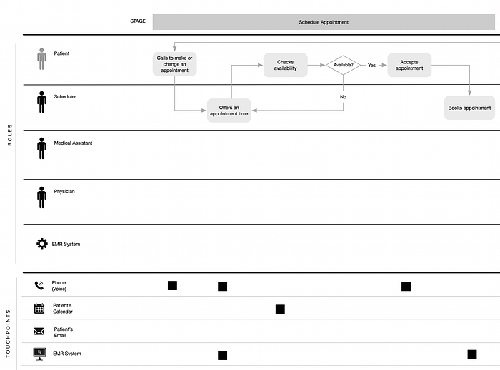
Perhaps the best-known artifact for capturing tasks flows is the current-state journey map. The advantage of the journey map is that it provides an at-a-glance representation of a start-to-finish flow that is easily consumable by a product team. A journey map typically represents goals, the overall task sequence, and the surrounding context — not specific details about each task. Additionally, current-state journey maps are typically evaluative — they may represent user emotions through the flow (highs and lows) and highlight specific pain points in the process. They also provide contextual details such as touchpoints — systems, tools, information, or other elements users “touch” as part of the current experience.
Consumer journey maps typically represent a chosen persona and their experience through purchasing a product or service, as shown in the example below.

There is a wealth of information on the web on consumer journey mapping.
Journey maps may also be created for business (enterprise) systems. Here rather than focusing on one individual’s journey, it’s more fruitful to capture tasks associated with an entire business process, which typically involves multiple roles.

I’ve written previously about current-state journey mapping for the enterprise and the special considerations around creating these maps.
Task Analysis
Task analysis provides more granular information about tasks that can be critical for informing design. The deeper understanding task analysis provides is particularly important for more complex tasks and for “all day every day” task performance where even small improvements can have a large impact. Task analysis may be used in place of or as a supplement to current-state journey mapping.
To capture the necessary detail for task analysis, video is your friend. You want to capture the tasks performed in their context and at their typical pace. Particularly for tasks that are performed at a fast pace, it’s helpful to set up a video camera to capture users’ activities as they work. You can then schedule follow up sessions with users to review the video with them to understand in more detail what they are doing and why.
Tasks analysis takes two complementary forms: a diagrammatic representation and a narrative (scenario) representation.
The task analysis diagram visually shows steps in the tasks and their relationships. The diagram can be color-coded to show user actions, system actions, and elements outside the system that support the task. In the diagram below, user actions are green, system actions are yellow, and supporting tools/artifacts are blue.

The advantage of the task analysis diagram is it makes it easy to grasp flow sequence and logic.
The task analysis narrative provides the opportunity to include more descriptive details about how the task is performed and the overall context. It can be helpful to choose an archetypical storyline — a particular scenario that is illustrative of the situation in which tasks are performed, as in the example below.
Anne is a current events image editor in the New York office. She started her day at home by flipping on CNN to get an idea of what stories might be “hot” today. It turns out there was a terrorist attack several hours ago. She knows it will be a busy day for her handling photojournalist submissions and choosing the best images.
- Anne logs into the system and scans the content of her image queue. Overall, there are about 300 images in her queue, but the priority today will be covering the terrorist attack. She will be keeping an eye on the newsroom monitors for any breaking news on the terrorist attack or any other hot stories that emerge. Although her priority is the terrorist attack, she needs also to be aware of any other breaking stories.
- Anne filters her queue to show only those images related to the attack (by filtering on time frame and location).
- With the attack images shown together, she manually arranges them (using drag and drop) so that images containing similar subjects are all together. This process also helps her do a preliminary evaluation of the submitted images.
- She selects a group of images that depict the same basic subject to view them in comparison mode. This mode allows her to see the images side-by-side and in more detail, so that she can make a well-informed decision on which images to select.
Overall, journey mapping and task analysis are similar in format and purpose — and there can be some overlap between them. For example, journey maps can include a task narrative to provide additional context and detail.
Envisioning the Future
Envisioning is the activity that explores how the experience can be improved and codifies it into a high-level vision. Envisioning is best done as a team effort with all necessary stakeholders represented, including product management, marketing, design, engineering, customer support, and sales. Envisioning should be based on not only an understanding of tasks, but broader factors such as industry trends, emerging technologies, and strategic imperatives for the business.
The process of molding all the necessary inputs into a product vision is outside the scope of this article but suffice it to say it involves working within some sort of strategic framework and/or feature prioritization scheme. Additionally, envisioning a future experience may be done at various levels — you could be envisioning a completely new product, a strategic shift for an existing product, or a set of more incremental product changes.
Future-State Journey Map
While the current-state journey map primarily serves an evaluative purpose (highlighting opportunities to improve the experience), the future-state journey map communicates the go-forward vision.
Creating a future-state map can work well on a workshop setting where there is a current-state map to use as a reference. I discussed the process in a previous article on future-state journey mapping for the enterprise — but the same basic approach works just as well for consumer experiences.
Storyboards
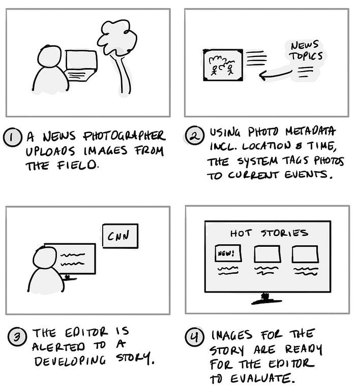
An alternative or complement to a future-state journey map are storyboards, which communicate the experience through a series of illustrated panels and a sentence or two of descriptive text.
Stylistically, storyboards can range from rough, low-fidelity sketches that might be prepared in a workshop setting to highly refined illustrations. They can illustrate people and environment in which tasks are performed — or they can show rough screen sketches — or a combination of the two.

Storyboards have the advantage of being more engaging and less abstract than a journey map. The concrete nature of storyboards can help stakeholders more easily grasp a future vision — and they can be used for concept testing with users to get early feedback on ideas.
Future-State Task Flows and Scenario Narratives
It’s also possible to take artifacts done for current-state task analysis (task flow diagram and scenario narrative) and create future state versions — or create these artifacts from scratch for the future state. These artifacts represent tasks at a more granular level, and can provide a bridge between higher-level envisioning and the product definition artifacts described below.
Defining the What
Understanding and envisioning drive to ultimately defining the intended experience. Defining at this phase involves communicating what the system will do, not how. UXers may or may not be directly involved in creating product definition artifacts such as user stories and use cases, but at a minimum we are consumers of them, and they are important to understand.
The two main artifacts discussed below are:
- User/Job-To-Be-Done Stories
- Use Cases
User/Job-to-Be-Done Stories
I’ve lumped two types of “stories” together for discussion purposes: user stories and job-to-be-done (JBTD) stories, as they are very close in format and purpose. User stories are a well-established format rooted in agile development methods. JBTD stories are a relative newcomer, and frame tasks not in terms of user needs, but on a specific situation driving a need.
Covering the entire JTBD framework is outside the scope of this article, but its roots are in consumer product marketing and understanding what drives purchasing behavior (“people don’t want quarter-inch bits — they want quarter-inch holes”). Though the general idea of JTBD has been around for decades, Clayton Christensen is credited with coining the term in his 2003 book The Innovator’s Solution. In recent years, JTBD theory has been ascendant, and one outcome has been the promotion of JTBD stories over user stories.
First, let’s look at a user story. A user story centers around a particular user/persona in its structure. A typical format is:

Example: As an image editor, I want to select the best news images so that publications will purchase our images.
The advantage of user stories is that they (at least ostensibly) focus product definition efforts on users’ needs. The <type of user> is normally tied to some type of persona definition to provide additional context on needs for that user type.
JTBD stories, on the other hand, have no reference to user type. The format instead is focused on the situation:

Example: When an important news story is breaking and time is of the essence, I want to select the best news images so that publications will purchase our images.
JTBD stories assume that user personas are not relevant (and actually misleading) for design. This stance has generated a fair amount of “personas vs. JTBD” debate online. In my experience, the anti-persona argument tends to rely on poorly-drawn consumer personas that rely on demographic details or other irrelevant information. JTBD stories have the additional challenge of having to map multiple situations to a single goal. For example, while the image editor does indeed select images under time pressure when there is a breaking story, they also select images on slow news days — a separate context that can be easily captured more centrally as part of a persona.
Use Cases
Compared to user stories, designers are probably less likely to encounter a set of prepared use cases in their work. With the rise of agile development methods, use cases have seemingly been supplanted by user stories. However, user stories and use cases are not equivalent artifacts. User stories frame tasks in terms of result and benefit, written largely from the business perspective. They are deliberately brief and designed to generate discussion. Use cases are more lengthy and definitive, describing more precisely what the system will do. Use cases provide necessary details in order to design and code a function.
Use cases are documented in two forms: the use case diagram and the use case narrative. The use case diagram illustrates actors (users) and their relationship to each use case. This provides an at-a-glance summary of system functionality (though use case diagrams for larger systems can become complex).

Use case narratives follow a prescribed outline, specifying actors, pre-conditions, primary (“happy day”) flows, alternative flows, and exception flows. There are various more elaborate use case formats, but actors, pre-conditions, and flows are always the central elements, as shown in the example below.
Use Case: Submit Images
Actor: Photographer
Overview: For the photographer to have their images purchased by the agency, they must submit them for review and evaluation.
Pre-conditions: The user is registered with the agency, has an active system account, has negotiated pricing terms for their images, and is currently logged in. The user has applied IPTC photo metadata to the images, per agency requirements.
Primary Flow:
1. The user selects one or more images to upload.
2. The user initiates the upload. The system provides status/progress on the upload and informs the user when it has completed successfully. The system records the date and time of the upload.
3. The user may see the status of each image submitted, whether it is pending review, has been selected for purchase, or has not been selected for purchase.
4. The user may sort and filter submitted images by submission status and by IPTC metadata.
Exception Case A: Upload Fails
1. If the system is unable to upload any images (for example, when the system is down or network connectivity is interrupted) the user is notified and asked to try again later.
Exception Case B: Images lack required metatadata
1. The system will not accept images that lack the required IPTC metadata. In this situation, the system will report on the images that were rejected based on lacking metadata so that the user may correct the problem and resubmit them.
Use cases should be written in a way that is UI-agnostic. The example above specifies that “the user initiates upload.” However, in the actual design, the user could initiate the upload in a variety of ways, for example by dragging and dropping files or by selecting files through a file browser.
Authoring use cases takes time and thought, but for designers writing even rough use cases can be a huge time-saver downstream where requirements might otherwise be unclear. Additionally, writing use cases forces you to think through the different system conditions (pre-conditions) under which tasks are performed — and the potential alternative paths when things don’t go as expected. The risk of not thinking through these details is that your design, once in development, may prove impractical once all conditions must be accounted for.
Designing the How
Designing how tasks are to be performed is clearly our main gig as UX designers. I’m not going to retread here methods around concepting, prototyping, and design iteration, since a wealth of information is available on those topics.
What I want to focus on instead is communicating design intent to others — particularly software developers. Unless you are working shoulder-to-shoulder with developers, an undocumented prototype leaves a lot of room for imagination. And even when I have been working in close concert with devs, I find that I can forget design intent that was evident at the time I did the design work!
We’ll look at two main artifacts:
- Screen flow diagrams
- Interaction specification
Screen Flow Diagrams
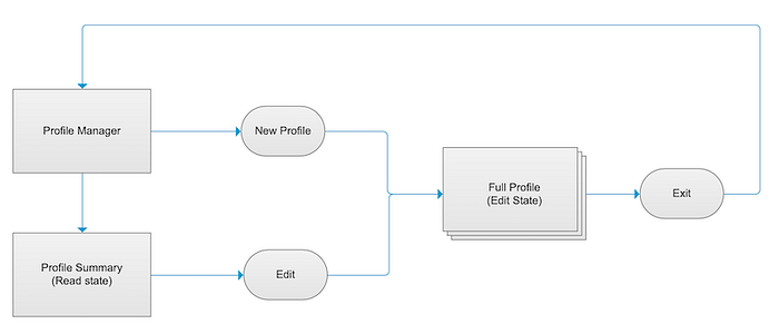
Screen flow diagrams show the primary and alternative paths through a flow. They are a similar boxes-and-arrows diagram to a site map, but illustrate tasks, not site or application architecture. The key with a screen flow diagram is to make clear what user actions trigger each movement along the path.

Screen flow diagrams not only help communicate design intent to developers, but they also can be a central part of communicating the design to stakeholders for feedback.
Interaction Specification
Finally, there is an interaction specification that documents screen-level behaviors. This documentation includes two types of functions:
- Interactions that apply across multiple screens (such as global search, which may or may not already be documented in a design system)
- Screen-specific interactions
The exact form of this documentation is dependent on your design tool of choice: I typically design in Axure and use a combination of page-level notes (for screen-specific interactions) and dedicated annotation pages (for broader conventions). The example below shows screen-specific interactions documented as a page-level note.

I write the interaction specification as I design — as soon as I am reasonably sure an approach is workable. I have found two advantages to this work practice. First, in having to document my work, it exposes problems or flaws in the design that weren’t otherwise apparent. This practice has saved my bacon on countless occasions, particularly when working with more complex applications. Second, documenting as I go along ensures that I capture all my design thinking and prevents me from having to do all the specification work at the end.
Building documentation into your daily work practice makes it easier. I reserve time at the end of each day to scan through my work to make sure the accompanying specification is current.
Conclusions
In this article, I’ve tried to provide an overview of how tasks are characterized throughout the lifecycle of a design project. For me, understanding the range of possibilities provides a toolkit to draw upon under different design circumstances. Even if some of these artifacts (such as use cases) aren’t a part of your formal design practice, consider what you might want to prepare informally to better-inform your design efforts.
Overall, the key is to provide transparency to tasks: how they are currently performed, how they might be improved, and how they should be ultimately supported in the system.
